


10-Year Treasury Chart Tracks Key Market Shifts
The interactive yield chart maps rates from 1962 to today, highlighting Fed moves and economic shifts.
• Detailed notes mark major crises and policy changes.
• The tool uses historical and live data to gauge market sentiment.
• Investors can quickly spot trends that may affect trading decisions.
By combining past and current data, this chart offers a clear view of market dynamics and helps investors plan their next moves.
Historical and Real-Time 10-Year Treasury Yield Chart Overview
This interactive chart shows 10-year Treasury yields from 1962 to 2026 using monthly data. It updates daily to reflect the annualized return for a fixed 10-year period, letting you compare past trends with the current market.
- Toggle the legend to switch between forecast vintages and rolling predictions.
- The x-axis lists dates while the y-axis tracks yields from 0% up to over 15%.
- Built-in notes highlight major Fed policy changes and economic crises.
- Monthly data points offer a detailed history, and real-time updates keep you informed.
Investors and analysts can use time-frame selectors to zoom in on specific periods or review the complete yield history. Annotations link key market events with yield movements for added context. Plus, export tools let you save data as CSV, PNG, or PDF, making it easy to share insights during strategy sessions.
Interpreting 10-Year Treasury Yield Movements and Patterns

The yield curve shows market expectations by comparing long- and short-term Treasury yields. When long-term rates are higher than short-term rates, it signals a normal economic outlook.
• An upward-sloping curve points to steady growth.
• A flattening curve, where the gap narrows, suggests slower growth ahead.
• An inverted curve, when the 10-year yield drops below short-term yields, has often come before recessions.
• A steepening curve, common after events like the post-2008 recovery, implies renewed market optimism.
History shows that before recessions, investors often see the yield curve invert as confidence in long-term growth fades. Aggressive rate hikes by central banks can also disrupt the usual upward pattern, linking policy moves to these shifts.
Investors use trend lines on yield charts to mark key levels (like 1%, 3%, 5%, or even above 15%) that act as support and resistance. These lines simplify the data into clear signals that help anticipate changes in market sentiment and yield movements.
Annotating Major Economic Events on the 10-Year Yield Chart
Annotations on the yield chart give clear signals on how key economic events have shifted long-term rates. They link government actions to changes in borrowing costs so investors can quickly understand market shifts.
• In 1980, during the Volcker era, rate hikes pushed yields above 15%, a clear sign of tightening policy.
• The dot-com bust in 2000 saw yields drop from about 6% to near 4%, reflecting market adjustments amid a technology downturn.
• During the 2008 financial crisis, yields fell below 2% by year-end as liquidity concerns deepened.
• In early 2020, pandemic responses drove yields under 0.6%, highlighting the market shock.
• In 2022, swift Fed tightening moved yields from near zero to over 4% in a matter of months, indicating rapid policy shifts.
These markers create a timeline that connects specific events to changes in yield percentages, making complex historical data more accessible and actionable for investors and analysts.
Forecasting Trends with 10-Year Treasury Yield Chart Models
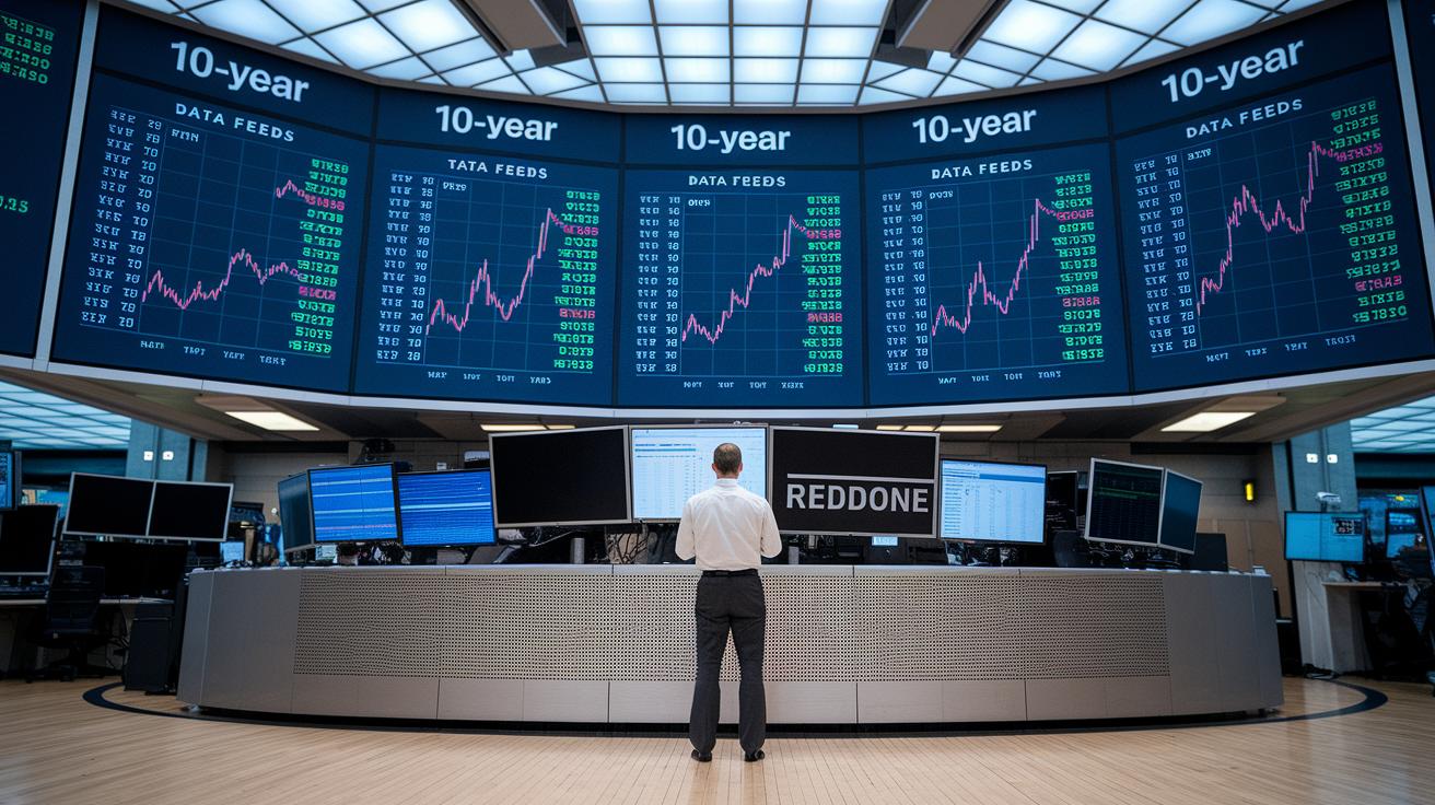
A daily-updated forecast model uses current yield data and futures prices to predict near-term moves in the 10-year Treasury yield.
• Daily live data drives the model.
• The forecast horizon is set to the fixed 10-year maturity to keep predictions relevant.
• Aggregated data gives traders and analysts clear, actionable insights on market sentiment and yield changes.
• The tool works much like the 10-2 yield curve model, offering near-term interest rate guidance.
The model pulls in fresh market inputs every day to show evolving trends. Its design links the forecast horizon to the 10-year maturity, ensuring that projections adjust with market shifts. This approach turns market data into practical insights that help gauge investor sentiment and expected yield movements.
Additional features boost scenario planning and risk checks. Users can compare historical forecast vintages, viewing early and latest monthly projections side-by-side, and track how a single future date’s predictions change over time. An extra quarterly-interpolated survey forecast adds an external benchmark. With an interactive legend that lets you toggle forecast lines on and off, market participants can personalize their analysis and make more confident choices about fixed-income investments.
Customizing and Exporting the 10-Year Treasury Yield Chart
Customize your chart for faster, clearer analysis. Use the built-in tools to zoom from a one-month view to the full historical range, so you can spot short-term events or long-term trends at a glance. Compare different Treasury maturities or add your own data using overlays. Adjust colors, scale the axes, and toggle annotations to match your analysis style.
• Use time-frame selectors to shift from one month to full history.
• Overlays let you compare varying maturities or custom data.
• Fine-tune color schemes, axis scaling, and annotations for clear visuals.
Export your findings easily. Download raw data as CSV and save images in PNG or PDF formats for sharing or review. API endpoints let you pull live yield data into your dashboard for ongoing analysis.
• Export options include CSV, PNG, and PDF.
• API endpoints support live data feeds for advanced analysis.
10 year treasury yield chart: Inspiring Trends

Inflation Data Overlay
Yields and inflation data work together to show how bond returns adjust when prices rise.
• Overlaying CPI or PCE data onto yield charts highlights real yield movement.
• When inflation speeds up, yields typically rise to keep real returns steady.
• This blend of raw yield numbers with consumer price trends gives a clear signal for future rate moves.
GDP and Labor Market Overlay
Linking GDP growth and unemployment stats with the yield curve helps track economic cycles.
• Quarterly GDP data shows periods of economic expansion or contraction alongside yield shifts.
• Rising unemployment or slowing GDP often leads the yield curve to flatten or invert.
• This combined view gives traders a clearer picture of when the economy may be slowing down.
Combined Visuals for Holistic Analysis
Merging inflation, GDP, and labor market data with key Fed and market annotations creates a full view of fixed-income trends.
• Annotations such as Fed rate-decision dates and major stock index moves add timely context.
• The integrated chart helps investors and analysts connect macro data with interest rate trends for a smarter market read.
Final Words
In the action, we reviewed how historical data, real-time updates, and interactive features come together in the 10 year treasury yield chart.
We saw how annotations mark key economic shifts and how forecast models and customization tools offer a clear view of yield trends.
The breakdown of core elements, from trend lines to export options, helps investors pinpoint tradeable opportunities quickly.
This hands-on overview provides ready insight for fast, confident decision-making and injects optimism as market trends continue to evolve.
FAQ
Q: What is the historical trend shown by the 10-year Treasury yield chart?
A: The 10-year Treasury yield chart history displays trends from 1962 onwards, marking shifts during economic cycles and major policy moves. This helps investors analyze long-term yield movements.
Q: How does the 2-year Treasury yield compare to longer-term yields?
A: The 2-year Treasury yield represents short-term rates and, when compared to longer-term yields, helps gauge the yield curve’s slope and signals market expectations about economic growth.
Q: What is the current 10-year Treasury yield?
A: The current 10-year Treasury yield indicates the latest annualized return for a constant 10-year maturity, updated daily to reflect real-time market conditions and investor sentiment.
Q: What details does the 30-year Treasury yield chart provide?
A: The 30-year Treasury yield chart offers insights into long-term bond yield trends, tracking rate fluctuations over extended periods to help assess the broader economic outlook.
Q: What does the 10-year Treasury price indicate?
A: The 10-year Treasury price shows the market value of U.S. government debt, which inversely correlates with yields, aiding traders in evaluating bond risk and investment potential.
Q: How is the 20-year Treasury yield used by investors?
A: The 20-year Treasury yield provides a mid-term benchmark, offering insights into bond trends and risk premiums, thus helping investors compare it with other maturities for a balanced view.
Q: What insight does a U.S. Treasury yield chart provide?
A: A U.S. Treasury yield chart aggregates historical and real-time data across different maturities, allowing market participants to view yield movements and responses to economic events in one visual tool.
Q: What is the forecast for the 10-year Treasury yield?
A: The forecast for the 10-year Treasury yield uses current market data, futures prices, and economic indicators to predict potential yield movements, assisting investors in planning their strategies.
Q: Why is the 10-year Treasury yield rising?
A: The 10-year Treasury yield may be rising due to improved economic data, expectations of higher inflation, and shifts in Fed policy, prompting investors to seek higher returns on bonds.
Q: What bonds are paying 9% interest?
A: Bonds paying 9% interest are typically higher-yielding non-Treasury instruments such as corporate or high-yield bonds, where the increased rates compensate for greater credit risks.